Reason #2 is that I take terrible pictures. Reason #437 is that I never take 'Before' pictures, or if I do I forget to post them! But the good news is:
- I found the pictures from the original listing, so better late than never
- I decided to stick with the yellow color in the sunroom. For now, anyway.
Here's the sunroom, since that was on the top of the to-do list for the weekend.
 |
| Before: the blandest room in all of Blandville |
What this photo can't possibly convey is how ugly the tile is, and how much the windows need to be replaced. (You know, the windows hidden behind the gawd awful curtains on brass curtain rods.) Mind you, the room hasn't looked quite like that since the day we got the keys: the first thing I did was to pull down all the window treatments.
The tile will be replaced someday, and I need to sew a cushion cover for the bench, but this is certainly an improvement:
It kind of makes me want to repaint the dining area, which is right next to it...but I'm going try to stifle that urge for as long as I possibly can.
So now on to the living area and the boys' playroom! (These will be more dramatic due to the addition of hardwood floors and removal of popcorn ceiling, but I'm taking credit for having done all that since I'll be paying it off for the next year....)
 |
| Before |
 |
| After (this caption is probably superfluous) |
 |
| Before |
 |
| (Bonus shot of Ollie looking for his squeaky mouse.) |
 |
| View from the informal (kitchen) dining area |
If you look closely, you can see the unpainted edges next to the ceiling; I couldn't reach any higher with a paint brush on our tallest ladder. Someday I'll address that....
How about that carpet, huh? And note the strip of tile in between the formal dining area and the living area. It matched the kitchen/informal dining area, so it had that going for it.
 |
| Before |
 |
| (Again: Ollie the photobomber) |
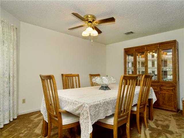 |
| Before: formal dining area |
 |
| Now: a play area for the boys |
I have to give the seller's realtor this: she took photos that look bright and clean, and the home looks ginormous! But despite my inept photography skills I think there's still an obvious improvement.
You might be wondering what's going on with the fireplace. As you can tell from the before and after comparison, I painted it white and that made a huge difference: it went from looking country to looking more modern and like an actual feature of the room.
 |
| (Full disclosure: I haven't even painted it yet, I've only primed it.) |
Those shapes in the middle are some rudimentary fretwork designs (just cut outs of paper).
I agonized over what to do with that center space: it's heavily textured wall, and I didn't like the look of either a mirror or a picture. I'll need to get some very thin balsa wood cut to size, nail it up there, paint it, and then apply the trim in whatever pattern I settle on.
Here's what gave me the idea:
 |
| Image: Burnham Design (http://www.burnhamdesign.com) |
Pretty amazing, huh? Here's something a little closer to what I envision:
 |
| (Sorry for the poor-quality photo) |
Both rooms need the ceiling fans replaced someday, but we'll get there.


No comments:
Post a Comment